Right now, your true performance is probably hidden. It’s lost in a pile of final scores, random stats, and that nagging feeling that you should be improving faster.
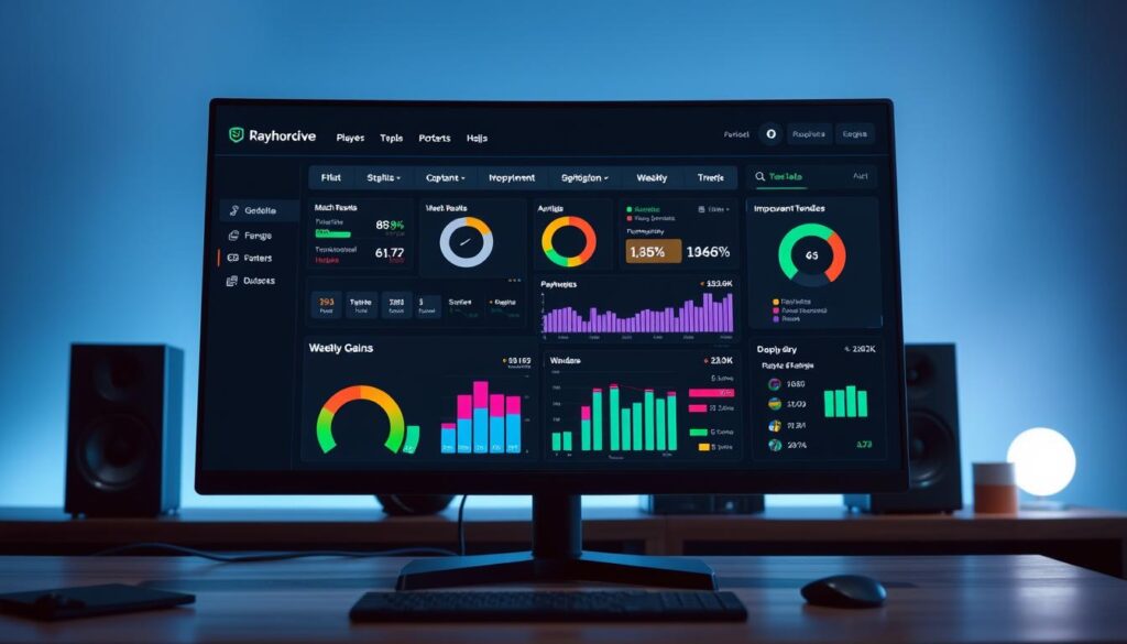
Imagine having a personal mission control panel, like a pilot or a race car driver. That’s what a performance dashboard is for you. It brings your most important numbers into one, clear view.
We’re going to move you from gut feeling to tracked metrics. This shift turns vague hopes into a clear path for weekly gains. Think of your new dashboard as a coach that highlights what’s working and warns you about what’s not.
This powerful approach is part of a bigger movement. As seen in our look at data’s influence on amateur sports. By the end of this guide, you’ll know how to build your own player dashboard. And start a journey from scattered matches to consistent improvement.
Choose 3 Outcome Goals and 6 Process Metrics
Think of your dashboard as a personal coach. It needs clear goals and feedback to guide you. This step is where we build the foundation. We’ll define your destination and draw the map to get there.
Let’s start with a simple definition. A KPI—or Key Performance Indicator—is just a number that shows how close you are to hitting a target. But not all numbers are created equal! The magic happens when you choose KPIs that provide a clear and actionable snapshot of your performance, perfectly aligned with your personal goals.
We break these into two powerful types: Outcome Goals and Process Metrics.
Your 3 Outcome Goals are your destinations. These are the big, motivating targets that tell you where you want to go. They are the results you dream about.
- Reach Diamond Rank in your competitive queue.
- Maintain a 1.5 K/D Ratio over the next season.
- Achieve a 60% win rate in solo matches.
Your 6 Process Metrics are your turn-by-turn directions. These are the smaller, daily numbers you have direct control over. They tell you how to reach those big goals.
- Increase Headshot Percentage by 5%.
- Average 50 Utility Damage per round.
- Reduce First Deaths in the opening minute.
- Maintain 80% Crosshair Placement Uptime.
- Secure 3 Ward Kills per game.
- Improve Last-Hit Differential at 10 minutes.
See the difference? The Outcome Goal is “Reach Diamond.” The Process Metrics are the specific skills you must improve to make that climb possible. This focus on choosing the right metrics is exactly what experts mean when they talk about choosing clear and actionable KPIs.
1. Be Specific: “Get better” is not a goal. “Increase my average crowd control score by 10%” is.
2. Make it Measurable: You must be able to track it with a number. If you can’t measure it, you can’t manage it.
3. Ensure it’s Influenceable: Your Process Metrics must be things you can directly affect through practice and focus. You can’t directly control a win, but you can control your positioning.
By defining these 3 Outcome Goals and 6 Process Metrics, you’ve done the most important work. You’ve given your dashboard a purpose. Now, every number you see will have a direct line to your personal growth. This targeted approach transforms random play into a structured improvement plan. Let’s start putting those numbers into your template!
Template Walkthrough: input, feature calc, trend lines, target zones
The template has a simple four-layer system for easy performance tracking. It’s like a data assembly line. Numbers go in, and clear insights come out.
You don’t need to be a spreadsheet pro. We’ve made it easy for you.
Let’s go through each layer step by step.
Layer 1: The Input Zone
This is where you start. Log your match data here after each play. Think kills, deaths, assists, and more.
Just open the template and fill in your numbers. It’s basic data entry. This layer is the base for everything.
Layer 2: Feature Calculation (The Magic Happens)
This layer does the magic. It turns your raw data into key metrics.
For example, it calculates your K/D Ratio and accuracy. You set the formulas once, and they update with new data.

Layer 3: Trend Lines (See Your Story)
This is where your player dashboard comes alive. Your metrics are plotted on a graph over time.
Now, you see if you’re improving. A rising line means better accuracy. A flat line shows a plateau. A dip means a problem area.
Layer 4: Target Zones (Know Your Goals)
The final layer adds context. We set visual benchmarks on your graphs. A green zone is your target.
When your line is green, you’re on track! Yellow is okay, and red means you need to focus. This makes goals easy to follow.
Designing these tiles is about clarity. You arrange charts to show your progress clearly.
These four layers make tracking easy and automated. Your player dashboard shows your journey. Now, analytics for performance is simple for everyone.
FPS Example: crosshair uptime, utility value, multi‑kill frequency
Imagine looking over your VALORANT match history. What numbers really show how you did? Win-rate is just a start. True analytics for performance shows the actions that win or lose rounds. Let’s dive into three key metrics from First-Person Shooters.
We’ll explain each metric, show how to track it, and why it’s important. This is KPI tracking in action, helping you improve your game.
Crosshair Uptime: Your Ready‑Aim Index
This metric shows how often your crosshair is ready for an enemy. It’s like your “ready stance.” A low score means you might be looking at the wrong things too often.
To calculate it, watch a VOD and note your crosshair position. Some tools can estimate this for you. Aim for over 70% for intermediate players. Use a line chart to track your progress over 10 matches.
Utility Value: From Throwing to Creating
This metric shows how much damage or crowd control your grenades and abilities do. It helps you use your utility wisely. For example, how long did your flash blind enemies?
You can find some data in your match history. For other stats, you might need to estimate. Aim for an average that helps you win rounds. Use a bar chart to see where you’re strongest.
This metric tracks how often you get two or more kills in a round. It shows your ability to turn rounds around. A player with high multi-kill frequency often wins close games.
This data is usually in post-match reports. It’s about how often you do well, not just one amazing round. Aim for multi-kills in 20% of your rounds. Use a trend line to track this over time.
Choosing the right chart is key for KPI tracking. Use line charts for trends and bar charts for comparisons. This makes the data easier to understand.
These metrics are like KPIs for your game. They measure the quantity, average value, and frequency of your actions. The table below helps you start your own FPS analytics for performance.
| Metric | What It Measures | How to Calculate / Find It | Good Target Zone (Intermediate) |
|---|---|---|---|
| Crosshair Uptime | Percentage of time aim is at enemy head level | Review VOD manually; some tools provide estimates | > 70% |
| Utility Value | Average damage or crowd control per round from abilities | Match history stats; estimate from game knowledge | Consistent positive impact per round |
| Multi-Kill Frequency | How often you get 2+ kills in a round | Standard in most post-match reports | In 20%+ of rounds played |
By focusing on these three metrics, you create a clear performance dashboard. You’ll see if your aim is off, if your utility is useful, and if you’re a clutch player. That’s the power of KPI tracking in your game.
MOBA Example: lane diff at 10, ward control, objective timing
Switching from FPS to MOBA games means new ways to measure success. Yet, your core strategy for getting better is simple. Your player dashboard is just as effective in League of Legends or Dota 2. It tracks the actions that lead to victory.
We’ll look at three key areas: lane dominance, vision, and objective control. These aren’t just feelings. They’re based on hard data. By tracking them, you turn random games into a structured improvement plan.

First, let’s define the key MOBA metrics. These numbers show the difference between consistent and sporadic players.
Lane Diff at 10: This shows your gold and experience lead over your lane opponent at 10 minutes. A positive number means you’re winning. A negative one means you need to improve at last-hitting and trading. It’s a clear measure of your early game skill.
Ward Control: Vision is key to winning. This metric tracks your ward placement and clearing per minute. It ensures you’re aware of the map. Good ward control and vision open up opportunities and prevent disasters. It’s a habit you can measure.
Objective Timing: This measures how early you arrive at Dragon or Baron spawns. Being early is what winning teams do. This metric trains your macro clock and helps you prioritize.
Here’s how these three metrics fit into your tracking template:
| MOBA Metric | What It Measures | Why It Matters | Sample Weekly Target |
|---|---|---|---|
| Lane Diff at 10 | Early laning skill (Gold/XP lead) | Winning lane puts pressure on the enemy and opens up roaming options. | +500 gold avg. by week’s end |
| Ward Control | Vision contribution (Wards Placed/Cleared per min) | Directly correlates with fewer deaths and better objective control. | 2.0 total wards/min |
| Objective Timing | Macro awareness and rotation timing | Arriving early secures positioning and often wins the fight before it starts. | Arrive 30+ seconds early for 80% of objectives |
See how specific that is? You’re not just saying “get better at macro.” You’re targeting three specific, trackable behaviors. This approach works because you’re the most important person involved. You need the detail that drives your growth!
Every week, you’ll enter your post-game stats for these three areas. The dashboard will show your averages and trends. Is your Lane Diff improving? Is your Ward Control slipping? The chart will tell you.
By focusing on these areas, you move from playing reactively to executing a data-driven strategy. This is how you build a true performance player dashboard for MOBAs. It turns every match into a step on your personalized improvement plan.
Action Layer: drill bank mapped to weak metrics
Imagine finishing your weekly review and knowing exactly what drills to run. That’s the power of the Action Layer. It’s where we stop just collecting data and start making real changes.
The Action Layer is like your personal coach. It adds a “Drill Bank” to your dashboard. This is a list of focused practice routines.
For example, your bank might include drills like “15-minute Aim Lab task tracking smooth mouse movement,” or “VOD review session analyzing the first engagement of each round.” These drills target specific, measurable skill gaps.
The magic happens when we map each drill to a key Process Metric. If your “Utility Value” score is low, your dashboard shows you the “Lineup Practice” drill. This connection is key.
Your dashboard now creates a custom improvement plan every week. It looks at your metrics, finds weak spots, and shows you the drills to fix them. This system eliminates guesswork from your practice.
This turns your weekly review cadence into a direct path for skill improvement. You spot issues early and have a clear action plan. This closes the feedback loop quickly.
Your performance dashboard is more than a report card. It’s an active personal coach. The Action Layer makes sure every insight leads to a clear next step, turning passive tracking into active mastery.
Share With Your Duo/Coach: communication checklist
Your personal performance dashboard isn’t just for solo review. Sharing it with a trusted duo partner or a coach multiplies its power. It turns individual insight into a team advantage.
Collaboration can get messy when everyone edits the same file. Tools like Oboard solve this with collaboration built right in. This keeps your data clean and your focus sharp.
Tailor your dashboard’s insights for your audience. Show your duo the specific metrics that matter for your combined play. This shared view creates a common language for improvement.
Use this simple checklist for your next session. First, prepare. Highlight two metrics that improved and one that declined. This sets a clear, data-driven agenda for your talk.
During the review, focus on the process, not just the match outcome. Talk about what the numbers show, not about making excuses. Say “our crosshair uptime dropped” instead of “I had a bad game.”
Set collaborative goals for the coming week. Agree on one or two process metrics to improve together. This makes your review cadence with others productive and positive.
A structured review cadence transforms feedback. It changes “you’re bad at this” to “our data shows we need more ward control next week.” You build not just skill, but true synergistic teamwork.