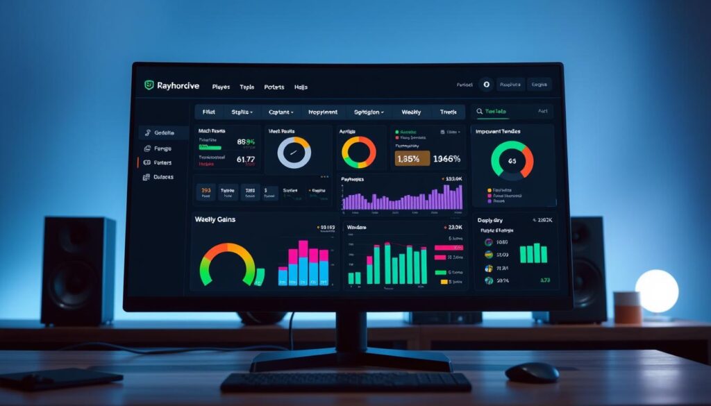
Forget the corporate jargon and mystical tech wizardry. A data dashboard isn’t some magical oracle—it’s more like the control panel of the Millennium Falcon.
Think of it as your personal data butler, serving up critical metrics on a silver platter while filtering out the noise. It transforms raw numbers into actionable intelligence that even C-3PO could understand.
Whether you’re tracking conversions, engagement, or retention metrics, a well-designed dashboard gives you real-time visibility into what’s actually working. You’re not just collecting data—you’re curating insight.
The beauty? It’s the difference between flying blind and having a fully operational battle station at your fingertips.
Free and Paid Dashboard Software
Welcome to the analytics buffet. Here, free tools are like IKEA furniture (they need assembly and might not be stable). Paid platforms, on the other hand, are like bespoke Savile Row tailoring (they fit perfectly but cost more). For coach analytics, you can choose from Google’s free Data Studio to high-end solutions like Tableau or Amplitude.
The key question is not which tool looks the best. It’s which one fits your analytics level. Starting small? Free tools are great for experimenting. Want to dive deep into your coaching strategy? Paid platforms offer the detail and customization needed to turn data into winning insights.
Amplitude shows us that dashboard assembly is important but not everything. It’s like having top-notch kitchen equipment. The chef’s skill, not just the tools, makes the meal.
VOC analysis tools tell us something important about choosing dashboards. The best platform listens to what your data needs to say, not what you want to hear. The most expensive tool is the one you buy but don’t use. So, choose based on your real needs, not just cool features.
Here’s the real playbook for picking your coach analytics platform:
- Free tools: Great for beginners, limited customization
- Mid-tier options: Better integration, some support
- Enterprise solutions: Full customization, premium support
Your data should only be as loud as your goals. Start where you are, not where you think you should be. The right dashboard will grow with you, not against you.
Collecting and Organizing Data
Ever tried building a championship team with data that looks like a toddler’s finger painting? Welcome to the beautiful mess of raw sports analytics. You’ve got numbers pouring in from wearables, game stats, training logs, and recovery metrics—it’s like trying to drink from a firehose while solving a Rubik’s cube.
Data collection without organization is the sports equivalent of herding cats. Possible in theory, disastrous in practice. That spreadsheet full of raw numbers? It’s about as useful as a map drawn by a drunk cartographer—you’ll end up in entirely the wrong neighborhood.
First rule of sports strategy club: identify your signal-to-noise ratio. What metrics actually matter for your coaching decisions? Player performance data, training load metrics, recovery statistics—these become your foundational datasets. Everything else is just digital confetti.
The organization part is where most coaches face-plant harder than a rookie attempting a triple axel. You need to establish clear data governance from day one:
- Consistent naming conventions (is it “HRV” or “Heart Rate Variability”?)
- Standardized measurement protocols
- Regular data hygiene practices
Clean your data religiously. Not every source provides complete information, and merging multiple streams creates duplicate entries and formatting inconsistencies. It’s like trying to assemble IKEA furniture with instructions from three different languages.
Think of your organized data system as your personal Library of Alexandria for sports analytics. Every piece of information should have its proper place, properly cataloged, and instantly retrievable. Because when game-time decisions hang in the balance, you don’t want to be that coach digging through digital rubble while the clock ticks down.
The right sports strategy emerges from clean, organized data—not from chaotic spreadsheets that resemble abstract art. Your playbook deserves better than guesswork disguised as analytics.
Visualizing Stats for Game Strategy
Ever tried reading a spreadsheet during halftime? It’s like trying to solve a Rubik’s cube blindfolded while the clock’s ticking. That’s where visualization transforms raw numbers into strategic gold.
Think of your data dashboard as the director’s cut of your game film. Where spreadsheets show you numbers, visualizations show you patterns. Where tables give you data, charts give you insights.
Heat maps become your X-ray vision into player movement. Shot charts reveal offensive tendencies like a tell in poker. Performance trend lines? They’re your crystal ball for predicting when athletes peak or decline.
Here’s how to turn analytics into your competitive advantage:
- Quadrant analysis categorizes players by performance metrics
- Radar charts compare skill sets across positions visually
- Time-series graphs track improvement over the season
- Heat maps expose spatial patterns and movement efficiency
The magic happens when visualization meets coaching intuition. It’s that aha moment when data clicks and strategy reveals itself. Like finding the cheat codes to your own game.
Your data dashboard shouldn’t just present numbers—it should tell a story. The right visualization turns complex information into digestible insights. It’s the difference between reading a playbook and watching the game unfold in 4K resolution.
Choose visuals that match your strategic questions. Need to compare player efficiency? Use bar charts. Analyzing spatial patterns? Heat maps are your friend. Tracking progress over time? Line graphs tell that story perfectly.
Remember: you’re not just creating reports. You’re building a strategic weapon. The kind that turns data into wins.
Sharing Insights with Teams
If your dashboard insights aren’t shared across your organization, you’re missing out. Data sharing is key in today’s sports world. Coach analytics only create value when they become a shared language.

Your dashboard is like the team’s nervous system. Assistant coaches watch training loads like air traffic controllers. Strength staff track recovery with NASA precision. Even players see their data, all working from the same truth.
Turning data into stories is where the magic happens. Numbers alone are useless. You need to create different versions for each stakeholder:
- Players get highlight reels for personal growth
- Coaches get the full analytics
- Support staff gets specific data
This makes your coach analytics a symphony orchestra. Everyone plays the same music, not jazz solos. This creates a strategic harmony that’s impressive.
Modern dashboard platforms make sharing easy. No more emailing spreadsheets. You create living data ecosystems, updated in real-time for the right people.
Decisions become smarter, not just guesses. Your team’s insights turn into actionable plans. This is the power of making your dashboard a team asset.
Automation Tips
If you’re manually updating spreadsheets, you’re stuck in the past. Automation is key to making data work easier. It turns tedious tasks into smooth processes.
Manual data work and report making waste a lot of time. Dashboards make these tasks automatic. This frees up time for real analysis and sports strategy.
Begin with simple tasks like automated data input. Set up reports and alerts for important data. This lays the groundwork for more advanced automation.
Conditional automation is where the magic happens. It’s like having a data intern that works all the time. It gives you insights when you need them most.
Here are some cool automation ideas:
- If player A’s recovery metrics drop below X, adjust their training
- When team trends show Y pattern, call a strategy meeting
- Notify coaching staff when important thresholds are hit
This isn’t about replacing people—it’s about freeing them up. Focus on coaching and strategy development. The best customer service dashboards show how automation turns data into useful insights. Sports analytics benefits the same way.
| Automation Type | Time Saved Weekly | Strategic Impact |
|---|---|---|
| Data Collection | 8-12 hours | High |
| Report Generation | 5-7 hours | Medium |
| Threshold Alerts | 3-5 hours | Critical |
| Conditional Workflows | 10-15 hours | Game-changing |
The table shows how different automations help your sports strategy. Notice how conditional workflows save the most time and have the biggest impact. Focus on these for the best results.
Automation should support your goals, not be the goal itself. The best teams use it to boost their human skills, not replace them. Combining your coaching skills with automation gives you a huge edge.
Start with small automation steps, see how they work, and watch your data become a powerful sports strategy tool.
Security
Your analytics dashboard is like Fort Knox for your competitive edge. It needs top-notch security. Imagine your rival seeing your playbook before the game – that’s what happens with leaked data.
Security is like a multi-layered defense. You need strict access controls, strong encryption, and detailed audit trails. These measures are like a hawk watching every move.

Granular permissions are key. Your head coach sees everything. Assistants get their area of data. Players check their stats. It’s about keeping things secure, not suspicious.
Most breaches aren’t big cyber attacks. They’re simple mistakes like sharing by accident or weak passwords. Your strategy should tackle these everyday risks.
| Security Layer | Implementation | Benefit | Complexity Level |
|---|---|---|---|
| Access Controls | Role-based permissions | Prevents unauthorized data viewing | Medium |
| Data Encryption | SSL/TLS protocols | Protects data in transit | High |
| Audit Trails | Login and access logging | Tracks all data interactions | Low |
| Multi-factor Auth | Mobile authenticator apps | Adds extra login security | Medium |
Creating a strong data fortress is important. It’s not about making it so secure no one can use it. It’s about finding the right balance between protection and usability.
Your data dashboard holds your most valuable information. Guard it well, but remember, the best security is both strong and easy to use. A perfect defense is useless if it can’t help you win.
Conclusion
Think of your dashboard as the start of a never-ending game. In coach analytics, it’s not about being perfect—it’s about making progress. Your dashboard grows from a simple score to a tool that predicts the future.
This isn’t about replacing your gut feelings with data. It’s about combining your coaching instincts with solid facts. The more you use your coaching metrics dashboard, the smarter you both get.
Begin with three important metrics that fit your coaching style. Try them out for a few weeks. This simple step can turn guessing into a solid strategy. You’re not just tracking the game; you’re learning to change it.
The future of coaching isn’t about more data. It’s about asking better questions. Your dashboard connects the dots between past and future. Build it, use it, and keep improving. The game is ready for you.